TL;DR: The best white paint for a NYC apartment depends on your light, your floors, and the mood you want. Benjamin Moore White Dove and Chantilly Lace cover most situations. Sherwin-Williams Pure White and Alabaster are strong alternatives. For something elevated, Farrow & Ball’s Wevet and Joa’s White add depth that flat-screen whites can’t match. And if you want texture and movement, Portola Paints Eastwood in lime wash is in a class by itself. Always sample before committing.
For most NYC apartments, Benjamin Moore White Dove (OC-17) is the safest starting point. It’s warm enough to feel inviting without reading yellow, bright enough to bounce light around a small room, and neutral enough to work with almost any floor or furniture. If your apartment gets strong south-facing light and you want something crisper, Chantilly Lace (OC-65) is the move.
But “best” depends on things most paint guides skip: the direction your windows face, old plaster versus fresh drywall, your floor undertones, and even your light bulbs. We paint apartments across Manhattan, Brooklyn, and Queens every week, and we’ve watched the same gallon of paint look like three different colors in three different rooms. Below, we’ll break down the whites that actually work in New York apartments and how to pick the right one for your space.
Why Is Picking White Paint So Difficult in NYC Apartments?
White paint is the hardest color to choose because it’s the most reactive. Every white has an undertone (yellow, gray, pink, green, violet) that stays hidden on the paint chip but shows up once it interacts with your specific light.
North-facing rooms get cool, bluish light most of the day. A warm white like Swiss Coffee will look clean here, while a cool white like Chantilly Lace might feel icy. South-facing rooms flood with golden light, which can push warm whites toward yellow. East and west-facing rooms change dramatically from morning to evening.
NYC apartments add another layer. Many prewar buildings have thick plaster walls with uneven surfaces that catch light differently than smooth drywall. You might also be dealing with limited natural light from small windows or neighboring buildings blocking direct sun. All of these factors make sampling essential.
Benjamin Moore’s Four Best Whites for NYC Apartments
Benjamin Moore dominates the NYC paint market for good reason. Their Regal Select and Aura lines offer excellent coverage, low VOCs (which matters when you’re painting in a building with shared hallways and limited ventilation), and a color matching system that stays consistent batch to batch. Here are the four whites we reach for most.
White Dove (OC-17)
White Dove is the one we recommend more than any other white, and it’s not close. It has an LRV (Light Reflectance Value) of about 83, which means it reflects plenty of light without being blindingly bright. The undertone leans slightly warm with a touch of taupe/gray that keeps it from ever looking yellow.
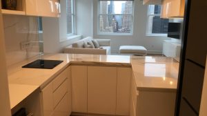
What makes White Dove special is its adaptability. In a bright, south-facing living room, it reads as a clean, warm white. In a darker hallway, it still feels fresh rather than dingy. It pairs well with both warm wood floors and cooler gray tones, which makes it forgiving if your apartment has a mix of finishes. We’ve seen it work beautifully in everything from a renovated Tribeca loft to a classic six on the Upper West Side.
One tip: if you’re using White Dove on walls, pair it with a slightly brighter white on the ceiling and trim. Chantilly Lace on the trim gives a subtle contrast that makes the whole room feel more intentional. Using the same paint sheen in the right places also makes a big difference. We typically do matte on the walls and satin on the trim.
Chantilly Lace (OC-65)
Chantilly Lace is about as close to a “true white” as you’ll find from Benjamin Moore. It has an LRV around 90, which means it reflects almost all the light that hits it. The undertone is nearly nonexistent, maybe the faintest hint of warmth, which keeps it from feeling sterile.
This is the white to use when you want crisp, clean, modern. It’s the gallery wall white. It works especially well in south-facing and west-facing apartments that get a lot of warm natural light, because the golden sunlight adds warmth that the paint itself doesn’t have. Where it gets tricky is north-facing rooms. In cool, indirect light, Chantilly Lace can read a little flat or even slightly blue. If your apartment doesn’t get much sun, test this one carefully before committing.
We also use Chantilly Lace frequently as a dedicated trim and ceiling color. It’s bright enough to give that clean line against slightly warmer wall colors, and it works well across different sheens.
Swiss Coffee (OC-45)
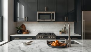
Swiss Coffee is the creamiest of the four, and it’s the right call when you want your apartment to feel warm and lived-in rather than stark. The undertone is distinctly yellow-warm, almost like the color of cream in coffee (fitting, given the name). It’s been one of Benjamin Moore’s best-sellers for years, and it’s a go-to for real estate stagers prepping apartments for sale.
Where Swiss Coffee shines is in apartments with a lot of warm elements. Honey oak floors, brass hardware, natural linen furniture. It pulls all those warm tones together into something cohesive. It also does well in rooms that don’t get much direct sunlight, because the warmth in the paint compensates for the lack of warm natural light.
The caveat: in a bright, sun-drenched room, Swiss Coffee can tip over into looking yellowy. If your apartment faces south and gets hours of direct sun, you might find it reads more like cream than white. In that situation, White Dove gives you warmth without the yellow risk. If you’re choosing paint colors that complement your wood floors, Swiss Coffee tends to pair best with cooler-toned or gray-washed hardwoods.
Cloud Cover (OC-25)
Cloud Cover is the dark horse of the group. With an LRV of about 80, it’s technically an off-white that borders on light greige. The undertone carries subtle gray and violet hints, giving it a modern, slightly cool quality without ever feeling cold.
Think of Cloud Cover as the antidote to yellowy whites. If you’ve been burned by off-whites that turned mustard on your walls, Cloud Cover goes the opposite direction. It stays clean and neutral in virtually any light. In north-facing rooms it reads as a soft, airy white. In south-facing rooms, warm light balances the cool undertone nicely.
One important note: Cloud Cover is dark enough that pairing it with a super-bright trim white (like Chantilly Lace) can create more contrast than you’d expect. The trim will look very white and the walls may read slightly gray by comparison. If you want a more seamless look, White Dove on the trim works better with Cloud Cover walls.
Does Sherwin-Williams Work Just as Well in NYC Apartments?
Absolutely. Benjamin Moore gets most of the attention in New York because of the local dealer network, but Sherwin-Williams makes excellent paint and has two whites that compete with anything BM offers.
Pure White (SW 7005)
Pure White is the Sherwin-Williams equivalent of a “do everything” white. It has an LRV of 84, right in the same range as White Dove, with a very subtle warm undertone that’s hard to pin down. It’s not yellow, not gray, not pink. It’s just clean. That neutrality is its biggest strength.
For NYC apartment dwellers who want one white for the entire space, Pure White is probably the best single-color option from any brand. You can differentiate surfaces by using different sheens rather than different colors. Flat on the ceiling, matte or eggshell on the walls, satin or semi-gloss on the trim and doors.
Alabaster (SW 7008)
Alabaster is Sherwin-Williams’ answer to Swiss Coffee. It’s a warm, creamy white with an LRV of 82 and noticeable yellow undertones that give it a soft, cozy feel. It was their Color of the Year back in 2016, and it’s remained a bestseller because it does what a lot of whites can’t: it looks inviting.
Like Swiss Coffee, Alabaster works best in rooms that benefit from added warmth. It’s particularly nice in bedrooms. The same caveat applies: in bright, sun-drenched rooms, the yellow undertone becomes more prominent than you’d like. In that situation, Pure White is the safer bet.
If you’re thinking about improving your apartment’s resale value with fresh paint, both Pure White and Alabaster are safe choices that appeal to a broad range of buyers.
Is Farrow & Ball Worth the Extra Cost for White Paint?
For the right apartment, yes. Farrow & Ball paint costs roughly twice what Benjamin Moore charges per gallon. What we can say from experience is that their whites look different on the wall. The pigment load is heavier, so the color has more depth and reacts to changing light in ways that other paints don’t. In a prewar apartment with tall ceilings and interesting details, that extra depth makes a real difference.
Joa’s White (No. 226)
Joa’s White is not really a white. It’s closer to a very pale warm taupe, with an LRV around 63, which puts it solidly in off-white territory. The undertone is warm and slightly pink/red, like the color of old plaster that’s been there for a hundred years.
That warmth makes Joa’s White a beautiful choice for apartments with limited light. It adds coziness without closing in the space, and it pairs exceptionally well with natural materials: linen, wood, stone, leather. In a prewar apartment with original moldings and hardwood floors, Joa’s White can make the space feel like it has history even after a full renovation.
Be aware that this is a strong off-white. If you’re expecting “white” white, you’ll be surprised. Test it in your space and live with the sample for a few days before deciding. It also looks best in Farrow & Ball’s Estate Emulsion (their chalky flat finish), which gives it that soft, matte quality that you can’t quite replicate with other brands.
Wevet (No. 273)
Wevet is the opposite end of the Farrow & Ball white spectrum. The name comes from an old Dorset word for spider’s web, and that description is accurate. It’s barely there. A whisper of gray-white that’s so pale it almost disappears into the wall.
With an LRV around 82, Wevet reflects plenty of light. The undertone is cool gray, which gives it that clean, contemporary gallery feel that works well in modern apartments. NYC designers love specifying it for minimalist spaces where the architecture and art are supposed to do the talking, not the paint.
The risk with Wevet is in north-facing rooms. Cool light plus cool paint can equal “washed out.” We’ve seen it work poorly in exactly that situation, where it just looked like nothing. South and west-facing rooms are where it really comes alive, because the warm sunlight balances the cool undertone and you get this luminous, sophisticated white that looks expensive. When we apply it, getting proper roller technique matters even more than usual because the flat finish shows every imperfection.
Portola Paints Eastwood Gives You Something Paint Can’t
Portola Paints is a small, LA-based manufacturer that’s been gaining a serious following among designers and high-end homeowners in New York. Their Eastwood color in lime wash is something entirely different from anything we’ve discussed so far.
Eastwood isn’t a typical wall paint. It’s a lime-based mineral finish that gets applied by brush (not roller) and dries to a soft, textured surface with natural variation in color and tone. The color itself is a light, earthy sandy greige, not a bright white but a warm, organic neutral that has depth and movement built into every brushstroke.
The look you get from Eastwood lime wash is impossible to achieve with conventional paint. Every wall becomes one of a kind. Highlights and lowlights appear naturally as the lime blooms to the surface, and the texture shifts subtly with the light throughout the day. In a NYC apartment, this kind of artisanal finish can transform a generic rental-white box into something that feels handmade and intentional.
A few things to know before going this route. Lime wash requires specific prep, including a dedicated undercoat primer from Portola. The technique is different: you work corner to corner maintaining a wet edge with a wide stain brush, not a roller. It’s not a DIY weekend project unless you’re experienced. And the cost is higher, both for material and labor.
That said, the result is worth it for the right project. We’ve applied Eastwood in bedrooms, living rooms, and dining rooms across Manhattan and Brooklyn, and clients always say the same thing: it doesn’t look like paint. Portola also formulates their lime wash with zero VOCs, which makes it a great choice for apartment painting projects where air quality is a concern.
What’s the Best Way to Test White Paint Before You Commit?
Use peel-and-stick paint samples on at least two walls in each room, then observe them at different times of day. Don’t rely on paint chips, phone screens, or store lighting. The only way to know how a white will look is to see it on your actual walls, in your actual light, next to your actual floors and finishes.
Benjamin Moore and Sherwin-Williams both offer these peel-and-stick samples, and Samplize is a good third-party option. They’re large enough to evaluate properly, and you can move them wall to wall without making a mess.
Put the sample on at least two walls in each room. Look at it morning, afternoon, and evening. Look at it with overhead lights on and with just natural light. And look at it next to your floors, your trim, and any fixed elements like countertops or bathroom tile. If you want to switch from a glossier finish to something flatter as part of this process, account for the prep work that requires, since sheen change affects how the white reads too.
Picking the Right White for Your Apartment
Here’s a quick decision framework based on what we see in real NYC apartments every week.
If your apartment is bright with south or west-facing windows, lean toward whites with less warmth: Chantilly Lace, Pure White, or Wevet. The sun adds warmth on its own.
If your apartment is dim with north or east-facing windows, lean toward whites with built-in warmth: White Dove, Swiss Coffee, Alabaster, or Joa’s White.
If you want one white for the entire apartment, Pure White or White Dove are the most versatile options.
If you want a designer-level look with more depth, Farrow & Ball Wevet (for cool, contemporary spaces) or Portola Paints Eastwood lime wash (for warm, organic spaces) will give you something generic contractor white never will.
And if you’re painting before selling, stick with White Dove or Pure White. Both appeal to the widest range of buyers and make any space feel fresh.
Ready to Get Started?
Choosing the right white is the hard part. The actual painting should be the easy part, especially if you hire a professional crew that knows how to prep NYC apartment walls, work within your building’s rules, and deliver a finish that looks clean and lasts.
At Soho Painters, we handle interior painting projects across Manhattan, Brooklyn, and Queens. Whether you’ve already picked your perfect white or need help deciding, we’re happy to talk through the options and get your project on the calendar. Get in touch for a free estimate.